|
|
Post by Gene on Feb 13, 2008 10:35:53 GMT -5
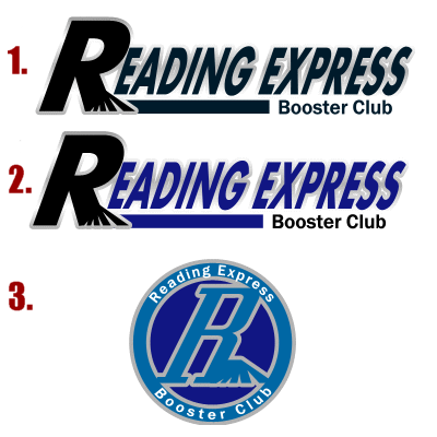
I had a few of the logos redone so we have our 3 final ones here up for vote. I'll run this poll for 24-48 hours afterwhich i'll have to settle on one. 
|
|
|
|
Post by rkozak201 on Feb 13, 2008 16:18:25 GMT -5
Definitley #1 and then #3 for a hat or even on the front of a shirt.
|
|
|
|
Post by Gene on Feb 13, 2008 18:05:47 GMT -5
Definitley #1 and then #3 for a hat or even on the front of a shirt. |
|
|
|
Post by scooter on Feb 13, 2008 23:22:02 GMT -5
I was thinking the same thing. You could put #3 on a hat or on a shirt sleeve.
If you were to get polo shirts at some point #3 would look good on those also.
Nice Job as always Gene!
|
|
|
|
Post by Free Agent Fan on Feb 14, 2008 16:50:51 GMT -5
I don't know............it's too cartoonish and needs more fierceness.  |
|
|
|
Post by Gene on Feb 14, 2008 17:00:58 GMT -5
I don't know............it's too cartoonish and needs more fierceness.  |
|
|
|
Post by Standard Deviation on Feb 14, 2008 17:46:21 GMT -5
I still like mine better.....
|
|
|
|
Post by expresszac on Feb 14, 2008 19:38:07 GMT -5
That one was pretty good Joe.
|
|